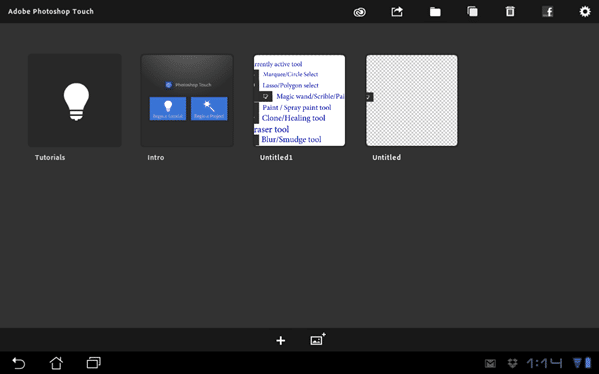
Right off the hop when you load Photoshop touch, you will be brought to this screen:
This is where you manage existing projects, organize, share and delete your files. The sharing aspect we will get to a bit later. The absence of a menu key is a bit jarring, I mean, all Android apps have a menu key! Another thing that is a bit confusing is renaming a file. You do not click or long hold the icon like you would probably expect to ( this instantly opens the file for editing ), instead you click the label below it. It makes sense eventually, but you will probably end up loading a project by accident a few dozen times before you get used to it out!
The pair of buttons at the bottom of the screen create a new image or loading from an image already on your computer, in Adobe’s Cloud storage, taken from the camera, from a Google search or finally, off of Facebook. If you select the + to create a new image a small Ok/Cancel dialog pops up asking you for your image dimensions. Here is the first real major limitation of PS Touch. You can’t go higher than 1600×1600. Period. Want to work on 1080p content, tough, you’re out of luck! This isn’t a big problem for me, as I usually work in power of 2 textures, so 512×512 and 1024×1024 are my most common dimensions, but often I like to work at double resolution so 2048×2048 and this isn’t an option for me. I know for many this is going to be a giant deal breaker. It does make sense though, many of these devices are RAM limited and a 2048×2048 image with multiple layers is going to bring your tablet to it’s knees quickly.
More on that later, back to the UI. Across the top, from left to right the icons do the following:
- Let you upload and open images from Creative Cloud, Adobe’s cloud service which plays a key part in all of their mobile apps.
- Share to the Camera Roll, publish to Facebook and Share by E-mail. If you thought the resolution limit part was bad… wait till I cover this part in a bit more detail!
- Add folders and Move files.
- Duplicate projects.
- Delete projects.
- Facebook integration… again for some reason. In this case its more for consuming, sharing and commenting on your artwork.
And finally, settings. This brings you to where you can create or configure a Creative Cloud account, configure your Facebook details, configure a very small ( as in 3 ) set of settings and finally Help, which basically just links you to their webpage/forums. Considering both links take you to the same page ( in your default browser ), I don’t know why they didn’t just take you there directly when you clicked help.
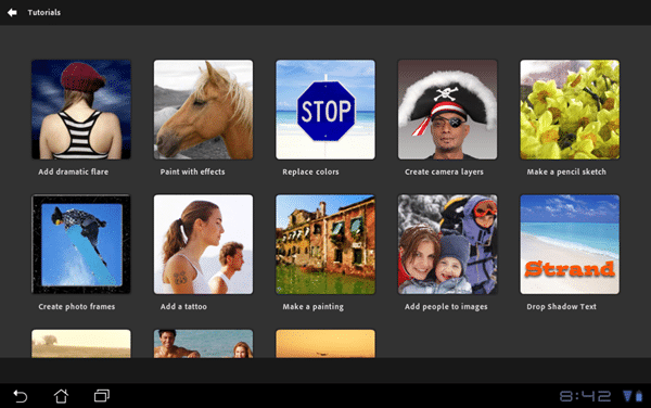
This stuff is all pretty secondary to the main event, the editor. Clicking on any project will bring you directly there, as will clicking the + icon, once you’ve chosen your screen dimensions. The one final part of the screen is the tutorial link. This quite obviously brings you to the tutorials.
As you can see, the tutorial set is pretty straight forward. Don’t get your hopes up about the “making a painting” or “make a pencil sketch” tutorials, both of them are actually about manipulating existing images using filters to give an artistic effect. They do a good job of quickly exposing you to the interface and abilities and cover the basics of using Photoshop Touch. All told, you can run through them all in about 15 minutes and even if you are an avid Photoshoper, it is probably worth the effort. None of the tutorials actually cover content creation mind you, although truth told, that is not this applications strong suit.
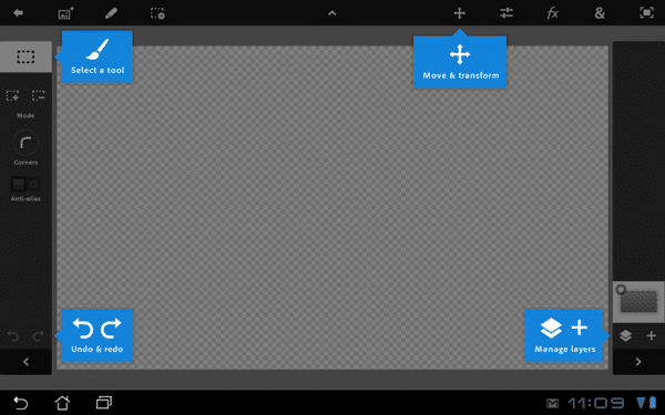
So, that’s the management and introductory screens out of the way, lets jump into the main UI, the first time you create a project you will be greeted with this screen:
Again, you will notice no menu button, which I find a bit disconcerting. There were a number of times I expected a context sensitive app to be in the menu, but it simply wasn’t there. I can’t help but think this is to keep the UI consistent across devices ( iPad ), but if you are on a tablet with physical buttons you are going to find it’s lack irritating.
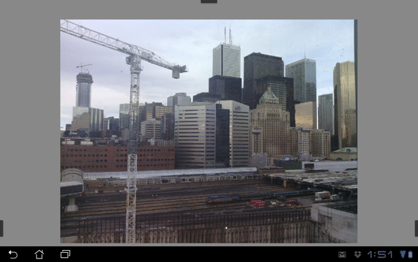
Anyways, back to the UI. Across the left you can basically think of that as your tool palette, while across the top is your menu bar. On the right hand side are your layer controls. All of the tools have undo/redo and frankly it goes extremely deep, at least 10 levels of undo, probably many more. We will cover each section in detail later. You will notice all of the sections have an arrow icon, < or > or /. This causes that area to collapse, leaving your UI quite clean. Navigating around an image itself is quite clean. The following is a view out of my office window ( taken within PS Touch ) with the UI minimised.
Navigation is pretty straight forward. You use the now universal “pinch to zoom” and, um, “unpinch to unzoom” that we are all used to. A single finger touch uses the active tool ( in this case rectangle select ), while a two finger touch and slide pans the image. Zoom supports up to 400% in and zooming out to 25%.
Minimized UI:
Maximum Zoom In:
Maximum Zoom Out:
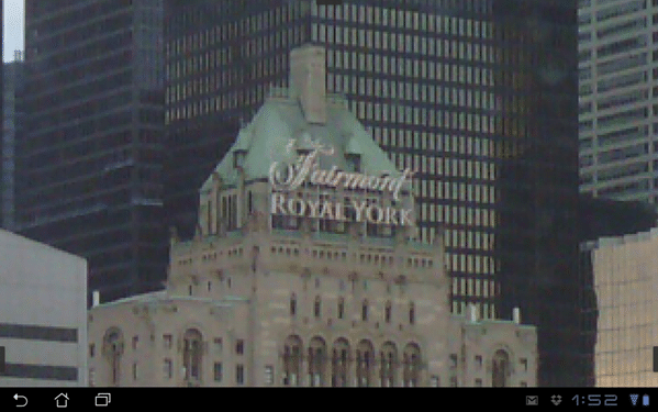
For most detail work on the tablet, that should generally be more than enough. Coincidentally, the bluriness on the zoomed in picture is not Photoshop’s fault, it’s the Transformer’s horrible camera.

